Dexpo Logistics Website
Complete Website Development for Delivery & Logistics Services
Client
Dexpo Logistics
Year
2024
Role
Full-Stack Developer
Duration
2 months

Complete Website Development for Delivery & Logistics Services
Dexpo Logistics
2024
Full-Stack Developer
2 months
Developed a complete multi-page application featuring Home, About, Services, and Contact pages with a quote request system integrated with Google Sheets. Implemented mobile-first responsive design, custom CSS theming, and dual contact forms to capture leads. The website showcases their three core services: Spoedlevering, Last-Mile Delivery, and Same-Day Delivery with professional credentials prominently displayed.
This project showcases my ability to deliver complete web solutions from planning to deployment. Let's build something amazing for your business!
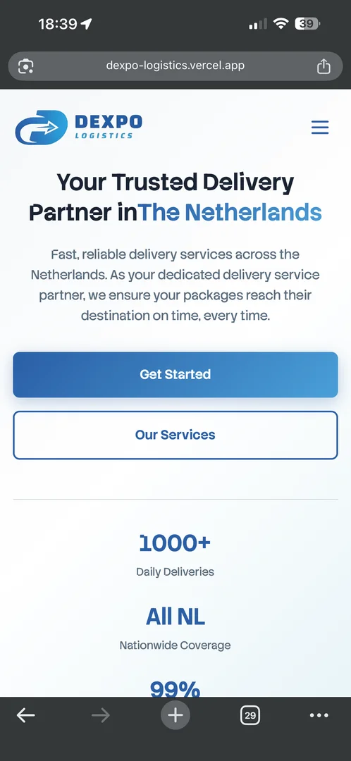
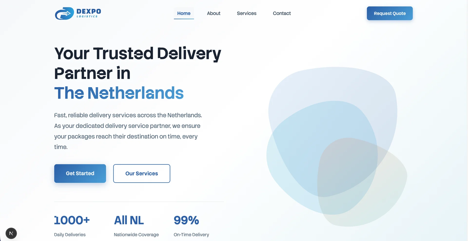
Full-viewport header with gradient background, animated morphing shapes (desktop), dual CTAs, and statistics display showing 1000+ Daily Deliveries, All NL Coverage, and 99% On-Time rate.
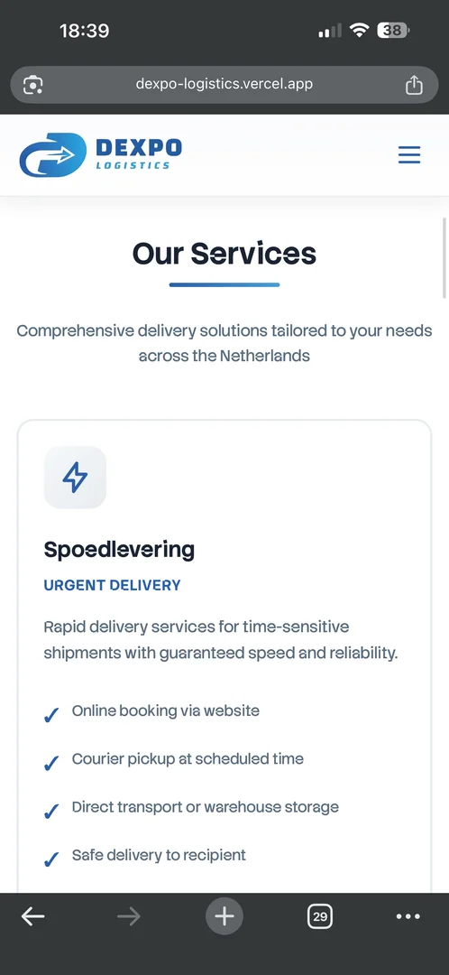
Three detailed service cards (Spoedlevering, Last-Mile, Same-Day) with feature lists, ideal-for tags, animated elements, and individual quote request buttons. Includes comparison table and 6-step delivery process.
Full-screen modal with 8-field comprehensive form including service type dropdown, addresses, preferred date, and package details. Features validation, success/error messaging, and Google Sheets integration.
Sticky header with scroll detection, transparent on hero becoming white when scrolled. Desktop horizontal nav, mobile hamburger with full-screen slide-in overlay, and body scroll lock when open.
Mobile menu content not visible when page was scrolled
Moved menu outside header DOM hierarchy using React Fragment for proper isolation. Implemented fixed positioning with viewport units and absolute positioning for nav content with scroll reset on menu open.
// Menu outside header
<React.Fragment>
  <div className="fixed top-0
    left-0 w-full h-16 z-40">
    {/* Header content */}
  </div>

  <div className={`fixed inset-0
    z-50 ${isOpen
      ? 'visible'
      : 'invisible'}`}>
    {/* Full-screen menu */}
  </div>
</React.Fragment>Google Apps Script returning HTML instead of JSON causing form errors
Added content-type checking in API route with fallback for unconfigured environments. Implemented console logging for debugging and clear error messages for users with environment variable validation.
From planning to production
Home, About, Services, Contact
Reusable React components
Custom styling code
Hero Section
Services Section
Why Choose Us
How It Works
#2B5FA6 - Trust, professionalism#4A9FD8 - Friendly, approachable#F27C38 - Energy, urgency#2DADA3 - Modern, reliable


Company story, mission & vision cards, 6 core values (Speed, Reliability, Teamwork, Innovation, Punctuality, Care), and prominent display of NIWO License and KIWA Certification with CTA.
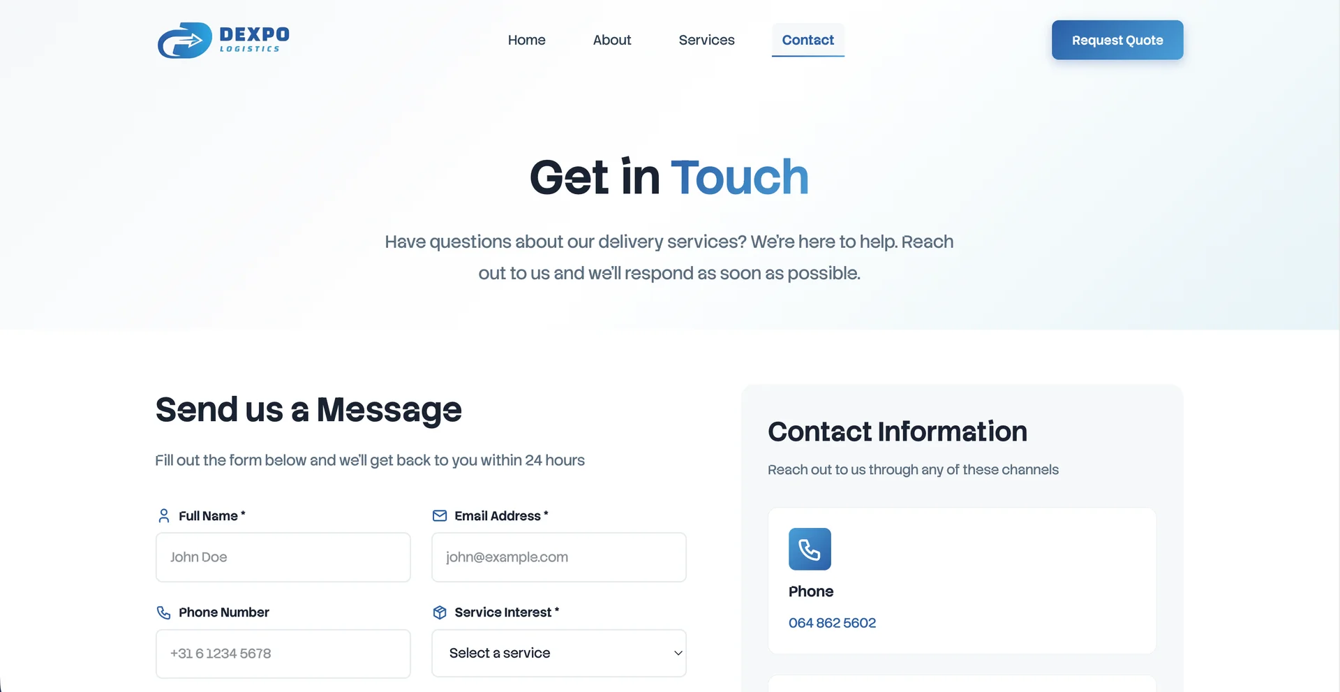
Full contact form with validation, multiple contact methods (phone, email, address), business hours display, social media links, and service area map placeholder.
Accordion with 8 common questions featuring smooth animations and mobile-optimized touch interactions for better user experience.
Automated form submission to Google Sheets via Apps Script Web App with timestamp tracking, form type identification, and chronological data storage for lead management.
const response = await fetch(
  scriptUrl,
  { method: 'POST', body: data }
)

const contentType = response
  .headers.get('content-type')

if (!contentType?.includes(
  'application/json'
)) {
  console.error(
    'Non-JSON response:',
    await response.text()
  )
  return NextResponse.json(
    {
      success: false,
      message: 'Config error'
    },
    { status: 500 }
  )
}Logo not scaling properly on mobile devices
Added mobile-specific CSS rules with different sizes for scrolled/unscrolled states. Used !important for specificity and proper media query placement to ensure consistent logo display.
/* Mobile logo sizing */
@media (max-width: 768px) {
  .logo {
    width: 120px !important;
    height: auto !important;
  }

  .scrolled .logo {
    width: 100px !important;
  }
}Hero buttons not properly centered on mobile
Changed button container from flex-row to flex-column with align-items center. Added proper width constraints and better spacing using gap property for consistent mobile layout.
.hero-buttons {
  display: flex;
  flex-direction: column;
  align-items: center;
  gap: 1rem;
  width: 100%;
}

@media (min-width: 768px) {
  .hero-buttons {
    flex-direction: row;
    justify-content: center;
  }
}Type-safe implementation
All breakpoints covered
FAQ Section
Stats Section
About Hero
Company Story
Mission & Vision
Team Values
Certifications
Service Details
Service Process
Service Benefits
Service Comparison Table
Contact Form
Contact Information
